← Back to gallery
GPT Image 2.0
admin
135 likes · 5,940 views
Prompt
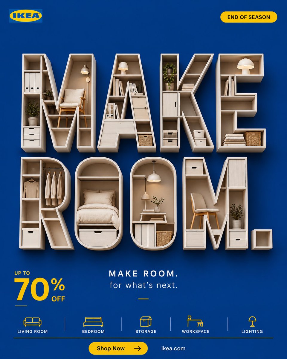
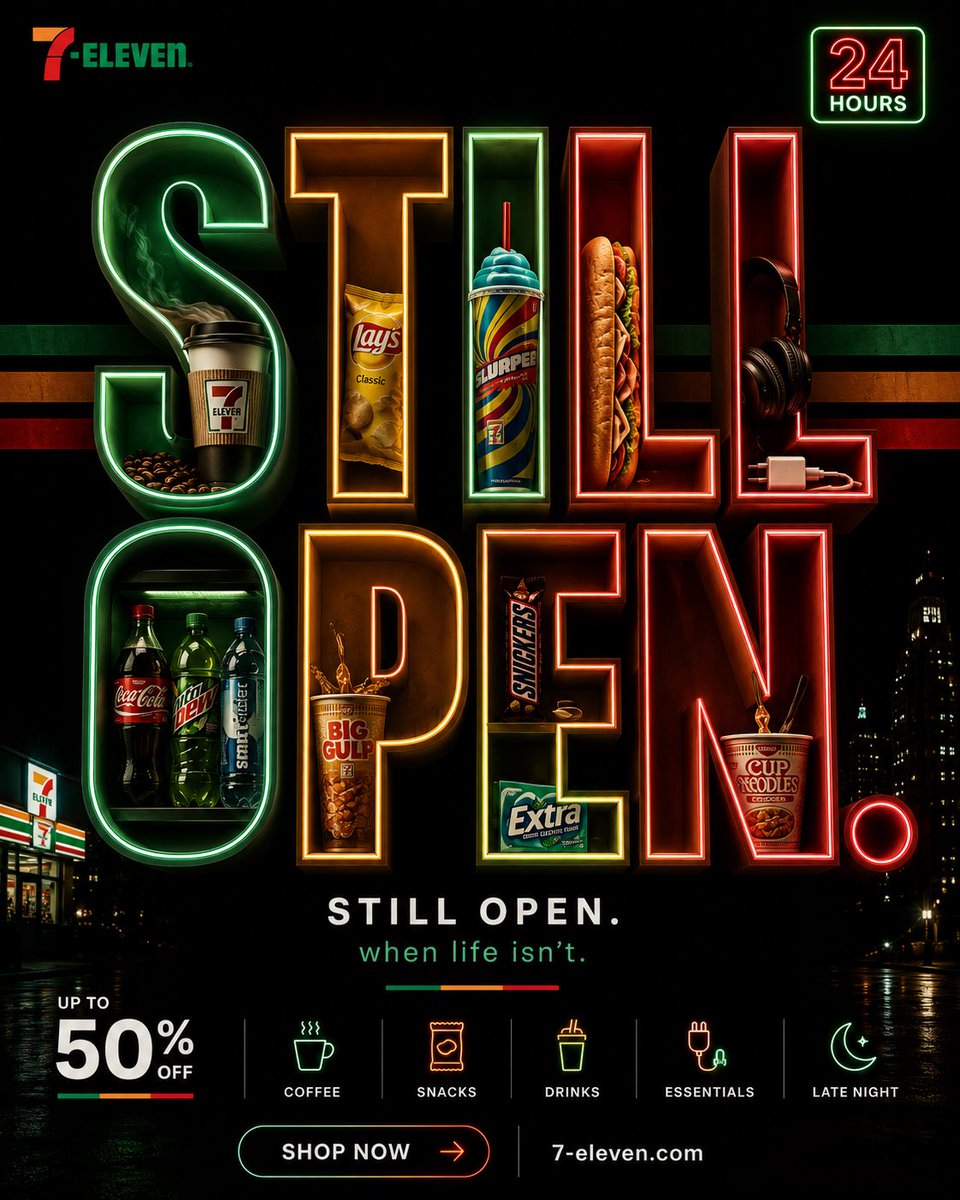
4:5 vertical ultra-premium seasonal retail campaign
IKEA global creative direction quality
Scandinavian design billboard system
8K

CORE IDEA:

To bring something new in,
something old must leave.

Make room.

VISUAL:

Massive typography:

MAKE
ROOM.

occupying nearly entire composition.

Ultra-bold.

Architectural.

Scandinavian scale.

Typography feels like furniture.

Not graphic design.

IKEA TWIST:

The letters themselves are modular.

Built from furniture pieces.

Shelves.
Tables.
Storage units.
Panels.

Subtle.

Not obvious.

When viewed closely:

the typography IS furniture.

INSIDE THE LETTERS:

Carefully integrated IKEA products:

- lamp
- chair
- storage box
- bedding
- side table

All embedded naturally.

Nothing floating.

Nothing exploding.

Everything organized.

[Hero Subject: Very IKEA].

BACKGROUND:

[Hero Subject: Pure IKEA] blue.

Flat.

Confident.

No gradients.

No effects.

Huge negative space.

YELLOW IKEA SYSTEM:

[Hero Subject: Subtle IKEA] yellow accents:

- offer
- dividers
- CTA
- icon system

Very controlled.

OFFER:

UP TO

70%

OFF

bottom-left

clean.

minimal.

small.

Because design remains hero.

LOGO:

[Hero Subject: Tiny IKEA] logo.

Top-left.

BADGE:

END OF SEASON

small yellow capsule badge

top-right

inspired by IKEA promotional systems.

BOTTOM ICON STRIP:

Living Room
Bedroom
Storage
Workspace
Lighting

Minimal line icons.

COPY:

MAKE ROOM.

for what's next.

CTA:

[Hero Subject: Shop Now]

ikea . [Hero Subject: Com

FEEL]:

IKEA
+
Muji
+
Apple
+
Scandinavian editorial design

Not a sale poster.

A design campaign
that happens to contain a sale.

Prompt 2 :

FORMAT:
4:5 vertical ultra-premium convenience retail campaign
[Hero Subject: Global OOH] billboard quality
7-Eleven internal creative direction
Fashion-street retail advertising
8K

CORE IDEA:

The season ends.

We're still here.

VISUAL:

Massive typography:

STILL
OPEN.

occupying nearly entire frame.

Ultra-bold.

Architectural.

Street-scale.

Typography dominates everything.

7-ELEVEN TWIST:

The letters are illuminated from within.

Like a convenience store at night.

Subtle green-orange-red glow emerging from typography edges.

Inspired by actual 7-Eleven storefront lighting.

INSIDE THE LETTERS:

Carefully embedded convenience essentials:

- coffee cup
- Slurpee
- snack bag
- sandwich
- headphones
- phone charger

Not luxury products.

Not furniture.

Not fashion.

Things people actually buy at 2AM.

BACKGROUND:

Deep night black.

Very subtle dark green undertone.

Huge negative space.

Feels like:

city at 2:13am.

ICONIC BRAND SYSTEM:

Large subtle 7-Eleven stripe system.

Green.
Orange.
Red.

Running horizontally behind typography.

Very faint.

Acts as composition structure.

OFFER:

UP TO

50%

OFF

small.

bottom-left.

Because availability remains hero.

LOGO:

Tiny 7-Eleven logo.

Top-left.

BADGE:

24 HOURS

small illuminated badge

top-right.

Inspired by actual store signage.

BOTTOM ICON STRIP:

Coffee
Snacks
Drinks
Essentials
Late Night

Minimal icon system.

COPY:

STILL OPEN.

when life isn't.

CTA:

[Hero Subject: Shop Now]

7-eleven . [Hero Subject: Com

FEEL]:

7-Eleven
+
A24 night photography
+
streetwear billboard design
+
convenience culture

Not a sale poster.

A lifestyle campaign
about being available.