← Back to gallery
GPT Image 2.0
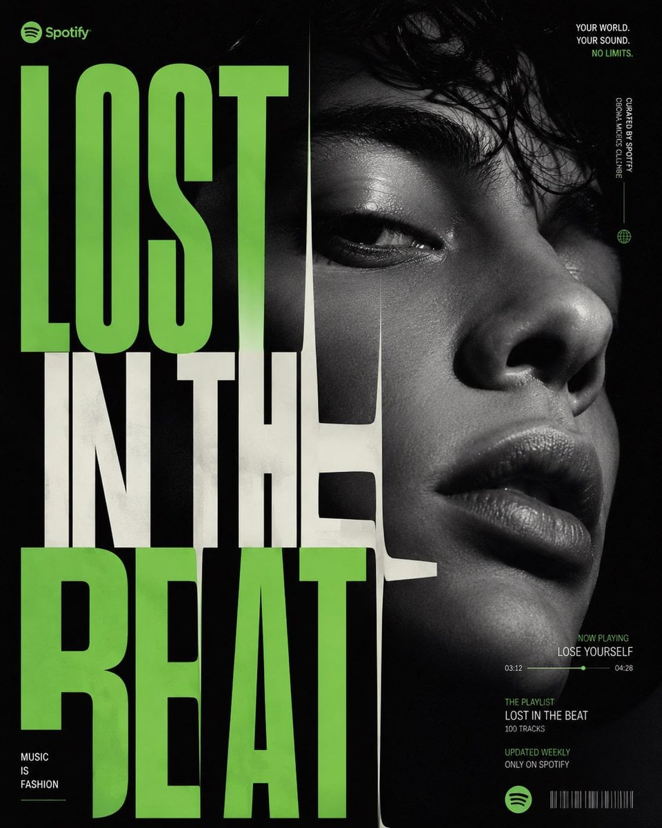
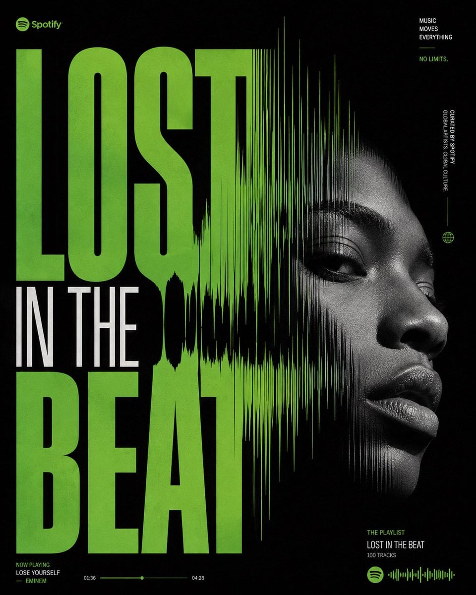
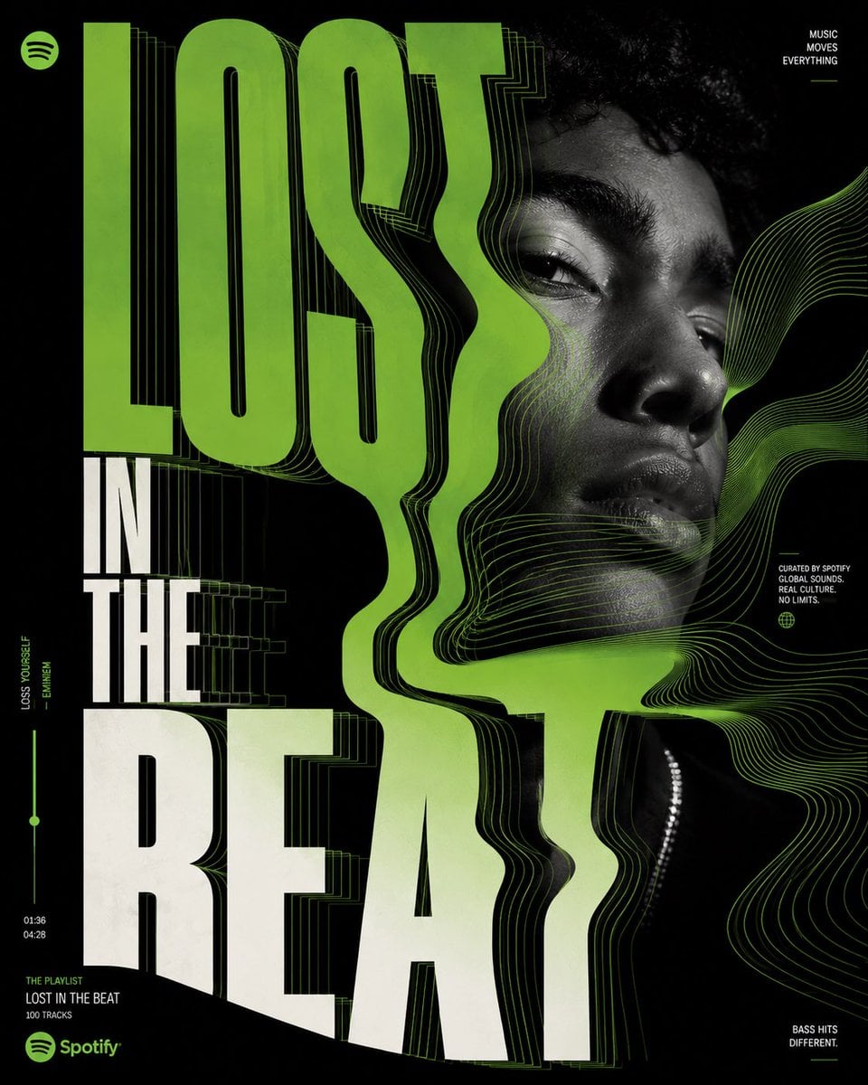
![[SPOTIFY — LOST IN THE BEAT]
Act as Spotify Creative Studio, AKQA, Buck, COLLINS, Pentagram and Media.Monks creating a](/gallery/2061316620254134507/0.jpg)
admin
100 likes · 3,522 views
Prompt
 [SPOTIFY — LOST IN THE BEAT]

Act as Spotify Creative Studio, AKQA, Buck, COLLINS, Pentagram and Media.Monks creating a Cannes Lions Grand Prix-winning social media marketing poster.

This is a premium Spotify campaign.

This is NOT AI fantasy art.

This is NOT a cyberpunk illustration.

This is NOT a floating-person poster.

Everything must feel intentionally crafted inside Adobe Illustrator by a senior designer.

CREATIVE PLATFORM

LOST IN THE BEAT

The visual idea is simple:

Music becomes movement.

The entire composition should feel like sound physically pulling the layout apart.

ART DIRECTION
Ultra-clean premium design.

Large-scale typography dominates the composition.

The words

LOST
IN THE
BEAT

become the visual hero.

Typography stretches, bends, compresses and flows as if affected by bass frequencies.

Parts of the letterforms subtly dissolve into waveform structures.

Certain edges distort from vibration.

No cheesy glitch effects.

No fake AI distortions.

Everything should feel deliberately designed.

LAYOUT SYSTEM

Swiss grid foundation.

Modern editorial layout.

Extreme hierarchy.

Massive oversized typography occupying 70% of canvas.

Negative space used intelligently.

Perfect alignment.

High-end poster design aesthetics.

Luxury magazine meets music culture.

SPOTIFY BRAND LANGUAGE

Official Spotify green.

Deep black background.

Subtle lime gradients.

Minimal white typography.

Tiny Spotify interface details integrated naturally.

Micro playlist metadata.

Small progress bar.

Track duration indicators.

Designer-crafted information hierarchy.

Nothing feels pasted.

MUSIC VISUALIZATION

Instead of generic equalizers:

Create elegant waveform ribbons.

Abstract frequency curves.

Data-driven sound structures.

Beautiful vector motion paths.

Dynamic rhythm patterns.

Everything feels premium and intelligent.

HERO SUBJECT

No floating character.

Use only a tightly art-directed portrait.

Young contemporary artist.

Shot like a luxury fashion campaign.

Strong expression.

Authentic attitude.

Monochrome treatment.

Placed strategically within typography.

Face partially interacting with letterforms.

Typography and portrait feel designed together.

TEXTURE

Illustrator vector precision.

Subtle grain.

Premium print texture.

Modern editorial imperfections.

Luxury poster finish.

No CGI energy swirls.

No liquid effects.

No random particles.

COLOR SYSTEM

90% black.

8% Spotify green.

2% white.

Extremely controlled palette.

Premium restraint.

TYPOGRAPHY

Massive custom condensed sans-serif.

Inspired by Spotify Wrapped,
Nike Campaigns,
Modern Music Festivals,
High-End Editorial Design.

Custom kerning.

Custom distortions.

Beautiful hierarchy.

Typography feels handcrafted.

MOOD

Sophisticated.
Youthful.
Cultural.
Modern.
Premium.
Obsessively art-directed.

The kind of Spotify campaign that wins Cannes Lions and gets featured on Behance Graphic Design Served.

1080×1350
4:5 aspect ratio

Vector-first design.
Adobe Illustrator aesthetic.
Premium social media advertising.
Brand campaign quality.