پرامپت پوستر و بصری
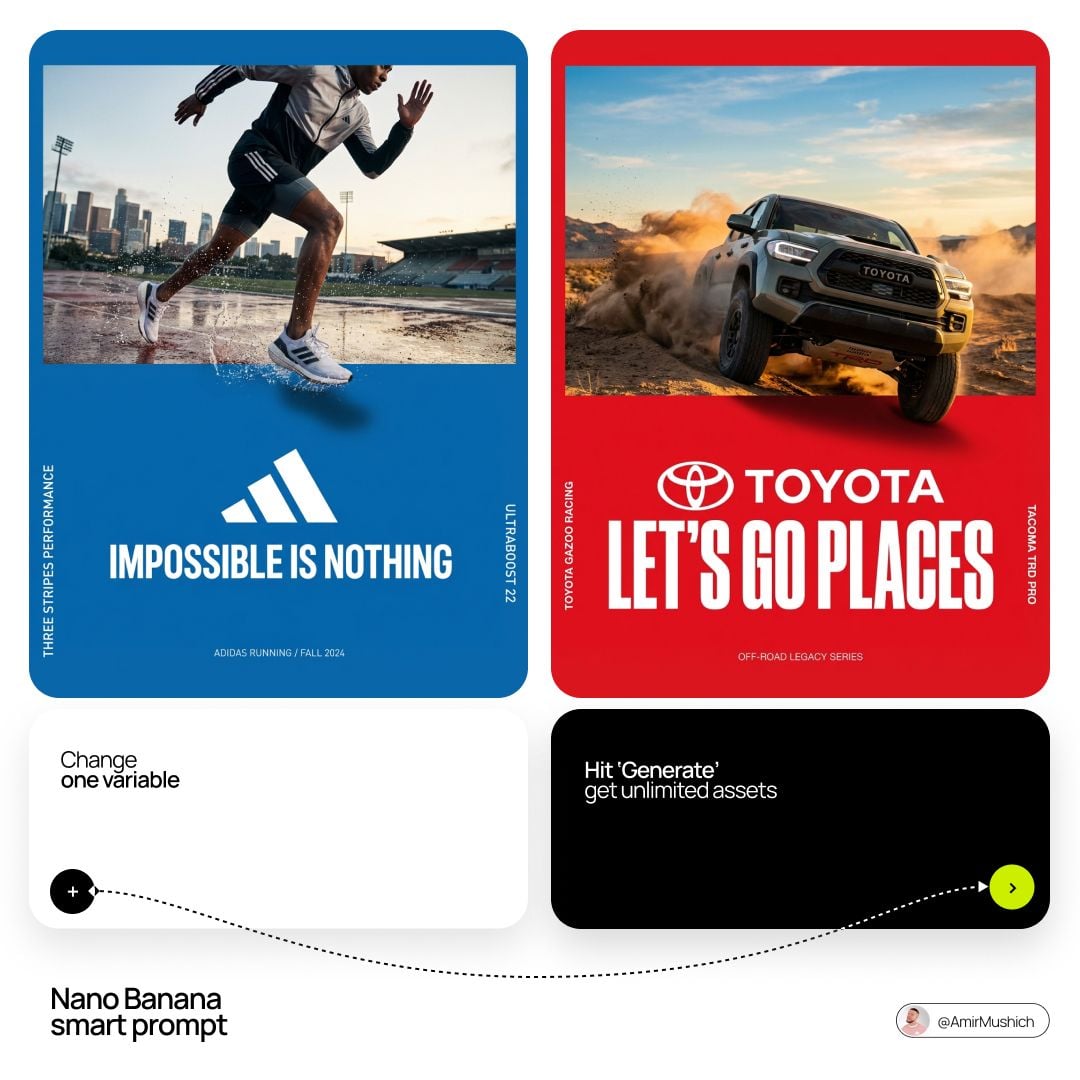
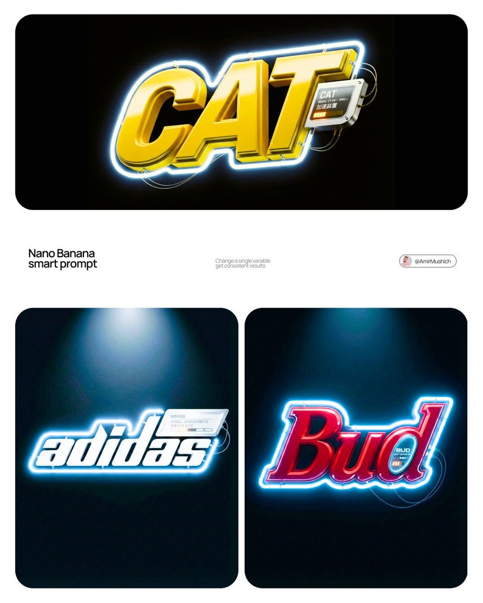
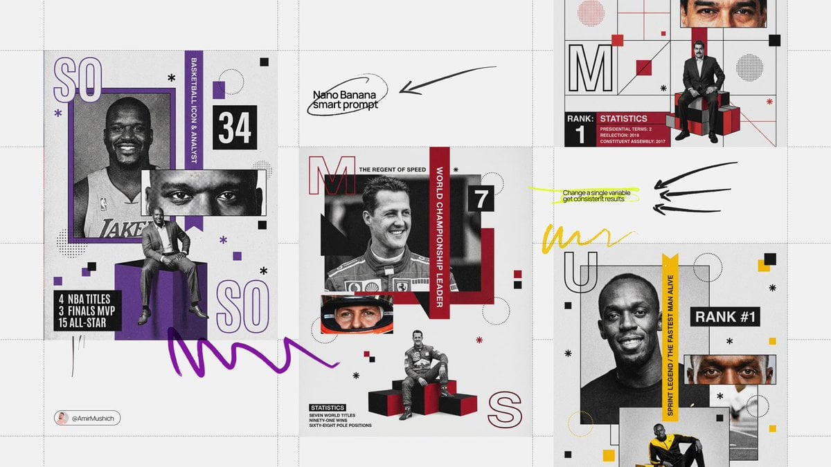
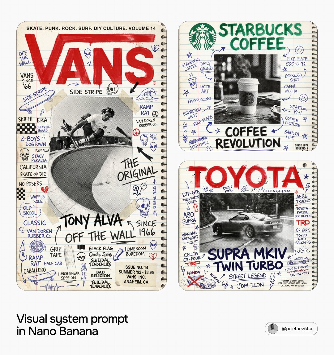
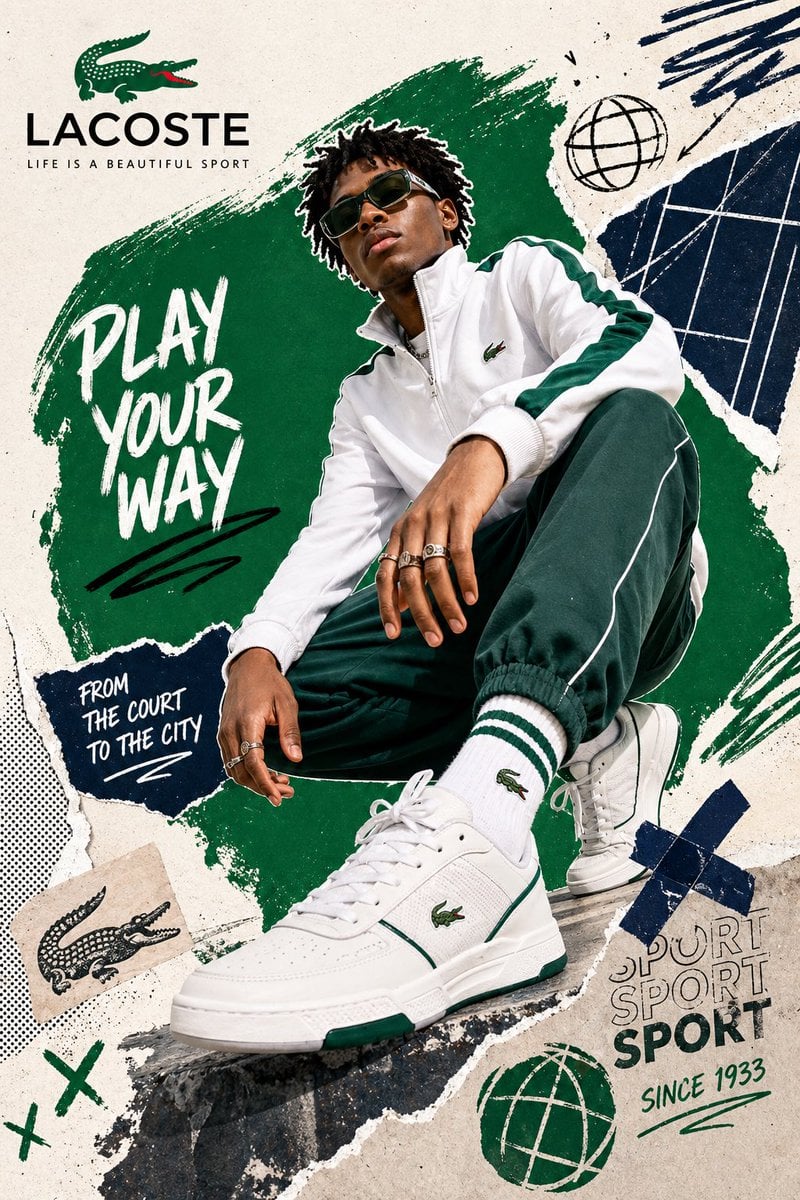
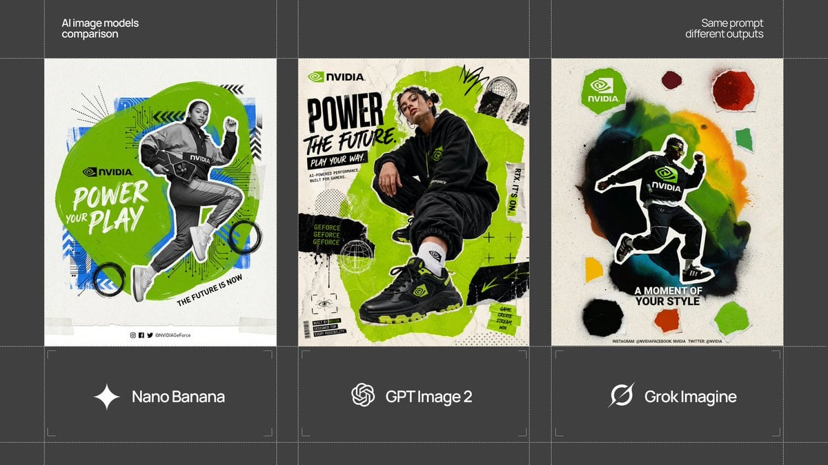
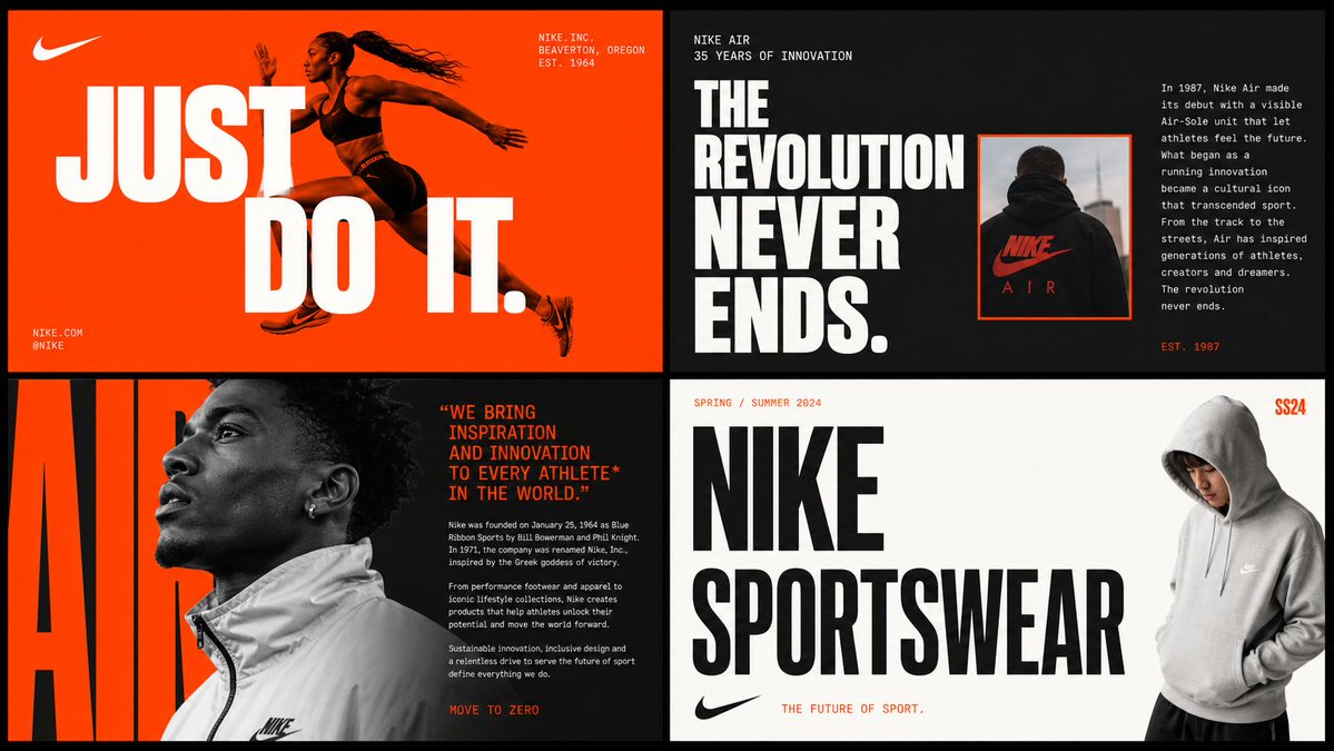
This prompt instructs an AI to act as a Senior Brand Art Director and Editorial Designer to create a 2x2 grid brand moodboard for '[Brand Name]'. It requires a deep dive into the brand's visual identity (colors, typography, language, visual codes) and references established brands like Ivy Park and Supreme. The moodboard will consist of four distinct editorial cards, each with a specific layout typology, unified by the brand's system. All content must be factual and brand-specific, with strict…
پرامپت «پرامپت پوستر و بصری» در Axeto.ai — پلتفرم فارسی تولید و کشف هنر هوش مصنوعی. این اثر با مدل Image GPT 2 تولید شده است. میتوانید پرامپت را کپی کنید، خروجی مشابه بسازید یا در گالری Axeto الهام بگیرید.
سازنده: Axeto Admin
پرامپت
[Brand Name] Act as a Senior Brand Art Director and Editorial Designer creating a 2×2 grid brand moodboard — four distinct editorial cards unified by [Brand Name]'s visual identity system. References: Ivy Park campaign editorial, Supreme lookbook layouts, Palace Skateboards zine design, Off-White editorial grids, Highsnobiety brand feature spreads. --- PHASE 0: BRAND INTELLIGENCE — AUTONOMOUS RESEARCH Before generating any visual, perform a complete brand decode of [Brand Name] from training data. Extract and apply all of the following autonomously: Color system: identify the exact primary and secondary brand colors — their specific hex values, how they are used in hierarchy (dominant background color, accent color, text color). These colors drive every card in the grid. Typography DNA: identify the exact typeface or typeface category [Brand Name] uses — serif, sans-serif, condensed, extended, grotesque, slab. Identify the weight hierarchy: what weight is used for headlines, what for body text, what for labels. Apply this typography system throughout all four cards. Brand language: identify the tone of voice, key phrases, campaign slogans, product categories, founding year, key collaborators, cultural positioning. Extract real factual information about [Brand Name] that can be used as text content across the four cards — real product names, real campaign titles, real dates, real locations, real brand statements. Visual codes: identify the photographic style associated with [Brand Name] — editorial fashion, sport, street, luxury, industrial. Identify compositional patterns the brand uses — full bleed photography, text-dominant layouts, graphic-only compositions, collage. All text content across all four cards must be real information about [Brand Name] — not placeholder text, not generic copy. Real brand slogans, real product lines, real campaign names, real founding information. --- PHASE 1: GRID SYSTEM The output is a single image composed of four equal rectangular cards arranged in a 2×2 grid. Total image dimensions: square or slightly landscape — 1:1 or 4:3 ratio. Each card is identical in size — exactly one quarter of the total image area. A thin gap of 4 to 6px between cards — neutral dark or light depending on brand palette. The four cards form a unified editorial system — they share the same color palette and typography but each has a distinct layout typology. Together they tell the brand story. --- PHASE 2: CARD 1 — HERO EDITORIAL (top left) Layout typology: large bold typography layered over or integrated with photography. Dominant background color: [Brand Name]'s primary brand color at full saturation — fills the entire card. Photography: a fashion or lifestyle image relevant to [Brand Name]'s visual world — model, product, or environment. The photo is either full-bleed behind the text or cropped into a specific zone of the card with text occupying the remaining space. Photo treatment: slight blend mode integration with the background color — the photo and background feel like one unified surface. Typography: the most recognizable [Brand Name] headline or slogan in the largest type size on the card — bold condensed, uppercase, white or brand secondary color. The text is large enough to partially overlap the photo. Secondary small text: brand name, location, date — set in small caps or tracking-heavy small type in a corner. The overall feeling: a magazine cover or campaign poster. --- PHASE 3: CARD 2 — EDITORIAL TEXT LAYOUT (top right) Layout typology: text-dominant editorial layout with a small photo inset. Background: [Brand Name]'s secondary brand color or a dark neutral consistent with the brand palette. Large headline: a real [Brand Name] campaign title or brand statement broken across multiple lines — each line a different size or weight, creating a typographic staircase effect. The largest line is very large, the smallest is medium, they are left-aligned creating a ragged right edge. Small body text column: a real paragraph of brand information — founding story, product description, or campaign context — set in small regular weight type, positioned in the upper right or lower right of the card. Photo inset: a small rectangular photo — 20 to 30% of card area — positioned where it interrupts or overlaps the headline text, creating editorial tension. The photo has a colored border or frame in the brand primary color. --- PHASE 4: CARD 3 — FASHION EDITORIAL (bottom left) Layout typology: photography-forward with typography as structural background element. Photography: a strong fashion or product image — model wearing [Brand Name] product, or a key product hero shot. The photo is positioned in the left 50 to 60% of the card, cropped tightly. Photo treatment: slightly desaturated or high contrast — editorial black and white or brand-tinted. Background typography: behind and around the photo, a very large single word or letterform from [Brand Name]'s identity — set at 200 to 300% of the card height, in the brand primary or secondary color, acting as graphic wallpaper behind the photo. This background type is partially obscured by the photo. Body text: a column of real [Brand Name] editorial copy — 3 to 5 short paragraphs, small regular weight, positioned to the right of the photo. Pull quote: one sentence extracted from the body copy, set larger and in brand accent color, positioned between the photo and the body text. --- PHASE 5: CARD 4 — CLEAN BRAND STATEMENT (bottom right) Layout typology: minimal, graphic, brand identity statement. Background: white, off-white, or the lightest tone in [Brand Name]'s palette — maximum contrast with the other three cards. Primary element: [Brand Name]'s wordmark or brand name set in massive type — ultra-bold, condensed or extended depending on the brand's typographic DNA. The wordmark is broken across 2 to 3 lines, each line flush left, occupying 70 to 80% of the card width. Type color: black or the darkest brand color — maximum contrast on the light background. Secondary element: a model or product image positioned at the right edge of the card, slightly cropped — human presence that grounds the graphic layout. The model/product is not the focus — the typography is. Accent element: a year, a number, a collection identifier, or a brand slogan set small in the brand primary color — positioned as a superscript or footnote near the main wordmark, adding a handwritten or stamped quality. --- PHASE 6: UNIFIED VISUAL SYSTEM Typography consistency across all four cards: all type is set in typefaces consistent with [Brand Name]'s identity. Headline type: one typeface, one weight — the boldest, most brand-representative option. Body type: one typeface, regular weight — legible at small sizes. No decorative or unrelated typefaces. Color consistency: only the colors identified in PHASE 0 appear across all four cards — primary brand color, secondary brand color, neutral (white or black), and one accent. No colors outside this palette. No gradients. No drop shadows. No textures on type. Information consistency: all text is real [Brand Name] information. No lorem ipsum. No generic placeholder text. Every word on every card is either the brand name, a real product name, a real campaign title, a real date, a real location, or a real brand statement. Grid alignment: elements across cards share implied alignment axes — a headline that starts at a certain x-position in card 1 aligns with an element in card 3 at the same x-position. This creates visual cohesion across the 2×2 grid when viewed as a whole. --- PHASE 7: TECH SPECS Output: a single flat image of the complete 2×2 grid. No separate files. Aspect ratio: 1:1 square or 4:3 landscape. Total resolution feel: high enough to read all body text clearly. Typography rendering: all type anti-aliased and crisp — no blurry text. Photography: editorial quality, not stock photography aesthetic. Color accuracy: brand colors exactly as identified in PHASE 0 — not approximated. No film grain unless it is a brand-authentic texture. No vignettes. No lens flare. Clean, precise, editorial. Output feel: this moodboard could be published on Hypebeast, Highsnobiety, or used as an internal brand presentation deck slide.
پرامپتهای مشابه