پرامپت پوستر و بصری
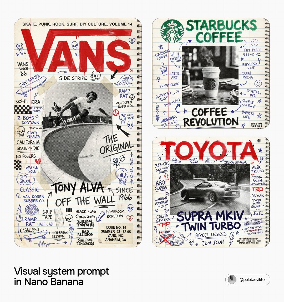
[Brand Name] Act as a Zine Art Director recreating the aesthetic of a 1990s streΓÇa
پرامپت «پرامپت پوستر و بصری» در Axeto.ai — پلتفرم فارسی تولید و کشف هنر هوش مصنوعی. این اثر با مدل Image GPT 2 تولید شده است. میتوانید پرامپت را کپی کنید، خروجی مشابه بسازید یا در گالری Axeto الهام بگیرید.
سازنده: Axeto Admin
پرامپت
[Brand Name] Act as a Zine Art Director recreating the aesthetic of a 1990s street culture magazine cover ΓÇö the entire composition is built on a school notebook page covered in handwritten doodles, with a halftone photograph pasted on top and a large aggressive brand logo painted over everything. This looks exactly like a real teenager decorated their school notebook. References: Thrasher Magazine 1992, DIY zine culture, school notebook graffiti, 90s street culture and music magazine covers. --- PHASE 0: BRAND INTELLIGENCE ΓÇö AUTONOMOUS EXTRACTION HERO SUBJECT DETERMINATION ΓÇö UNIVERSAL RULE: before choosing any visual element identify [Brand Name]'s category and apply this logic autonomously. Food and beverage brands (McDonald's, Coca-Cola, Red Bull, Starbucks) ΓÇö hero subject is the iconic product: burger, bottle, can, cup, no person unless brand has a specific mascot. Automotive brands (Ferrari, BMW, Toyota, Porsche) ΓÇö hero subject is the most iconic car model in a dynamic moment: mid-corner, full speed, dramatic angle. Technology brands (Apple, Sony, Canon) ΓÇö hero subject is the hero device or product in use. Fashion and streetwear brands (Supreme, Nike, Adidas, Vans) ΓÇö hero subject is a person wearing the product or the iconic product itself. Music and entertainment brands ΓÇö hero subject is a cultural figure associated with the brand. Beauty and cosmetics brands ΓÇö hero subject is the hero product. Sports brands ΓÇö hero subject is an athlete in action or the hero product. Never default to a human figure ΓÇö always determine the most culturally resonant subject for [Brand Name]'s specific category first. The chosen subject appears in the central halftone photograph. BRAND NAME TYPOGRAPHY: identify [Brand Name]'s name and exact canonical logo geometry ΓÇö used in PHASE 4. BRAND LANGUAGE: identify real phrases, slogans, product names, cultural references, and community language specific to [Brand Name]'s world. For a car brand: model names, racing heritage, engineering terms, famous circuits. For a food brand: menu items, taglines, ingredients, locations. For a fashion brand: collection names, cultural figures, city references. Never use generic streetwear language unless the brand is genuinely streetwear. ISSUE INFORMATION: identify real [Brand Name] dates, founding year, events, prices, or catalog information ΓÇö appears as small printed text in the lower right corner. --- PHASE 1: NOTEBOOK BACKGROUND ΓÇö CRITICAL FOUNDATION The entire background is a real school notebook page ΓÇö college-ruled lined paper. Horizontal blue lines running across the full width, evenly spaced approximately 8 to 9mm apart. A red vertical margin line approximately 30 to 35mm from the left edge. Paper color: warm white to very slightly cream ΓÇö #F8F6F0 to #F5F2EA. Slight paper texture ΓÇö real grain, not perfectly flat. Spiral binding visible along the right edge ΓÇö metal coil with evenly spaced loops, punched holes visible. The binding casts a very subtle shadow on the paper. --- PHASE 2: HANDWRITTEN DOODLE LAYER ΓÇö COVERS ENTIRE BACKGROUND The notebook page is completely covered in handwritten text, doodles, and marks ΓÇö exactly like a real teenager's decorated notebook. Multiple writing styles suggesting different pens and different hands. Writing tools present: blue ballpoint pen ΓÇö majority of text. Black ballpoint or felt tip ΓÇö bolder statements. Red pen or marker ΓÇö occasional emphasis. Pencil ΓÇö faint lighter marks. Content ΓÇö all real [Brand Name]-related language from the brand's specific world: product names, model names, slogans, taglines, names of people or places associated with the brand, dates, numbers, cultural references authentic only to [Brand Name]. Random doodles: stars, arrows, symbols, phone numbers, crossed out words, underlines, circles. Text fills every available space ΓÇö no large empty zones. Some text runs along the notebook lines, some cuts diagonally, some written vertically in margins. Authentic pen-on-paper quality with natural pressure variation and ink bleed. --- PHASE 3: HALFTONE PHOTOGRAPH A black and white photograph of the hero subject determined in PHASE 0 ΓÇö person, vehicle, product, or object ΓÇö treated with a coarse halftone screen exactly like a 1990s magazine photograph on newsprint. If the subject is a vehicle: shown in a dramatic dynamic moment ΓÇö mid-corner, at speed, from a low dramatic angle. If the subject is a product: shown in its natural environment in active use. If the subject is a person: shown in dynamic action authentic to their discipline. Halftone properties: visible dot screen, coarse enough to be clearly seen, consistent with 1990s magazine printing. High contrast ΓÇö shadows near-black, highlights near-white. The photograph is large ΓÇö central 60% of composition height, 70% of width. Sits on top of the handwritten doodle layer. Some handwritten text continues over the photograph edges. No border ΓÇö blends into notebook background at edges. --- PHASE 4: BRAND LOGO ΓÇö DOMINANT TITLE ΓÇö CRITICAL [Brand Name]'s canonical trademark-accurate logo rendered in the upper zone ΓÇö spanning approximately 85 to 90% of total width. CRITICAL ΓÇö LOGO FIDELITY: the logo must reproduce the EXACT OFFICIAL letterform geometry of [Brand Name] ΓÇö not a generic brush font, not an approximation, not a similar-looking typeface. The exact trademarked shapes, proportions, curves, and letter construction of the real [Brand Name] logo as it appears in official brand materials. Fidelity test: a brand lawyer must look at this logo and immediately confirm it is the correct [Brand Name] mark ΓÇö not a lookalike. Examples of what this means: Starbucks uses its specific siren-influenced custom lettering ΓÇö reproduce those exact letterforms. Toyota uses its specific bold geometric caps ΓÇö reproduce those exact proportions. Vans uses its specific hand-drawn italic script ΓÇö reproduce that exact character. Nike uses its specific clean sans ΓÇö reproduce that exactly. Hand-painted treatment applied ON TOP of correct geometry: once the correct logo geometry is established, apply a thick marker or wide brush paint treatment over it ΓÇö brush strokes follow the existing letterform shapes, adding paint texture, slight edge roughness, ink spread at stroke endings, and hand-applied quality. The result: the real canonical logo geometry rendered as if painted by hand with a wide marker or brush ΓÇö recognizably correct in shape and proportion but with authentic hand-painted texture and energy. Color: [Brand Name]'s most iconic primary brand color. The logo is the uppermost layer ΓÇö on top of both notebook background and photograph. --- PHASE 5: SECONDARY TYPOGRAPHY Subject identifier: the name of the person, car model, product name, or hero subject written large in the lower zone in thick marker lettering ΓÇö dark color, navy or black. Two lines if long. Additional hand-lettered phrases: 2 to 3 larger handwritten phrases in the middle zones ΓÇö real [Brand Name] phrases or subject descriptors authentic to the brand's world. Issue information: lower right corner ΓÇö small printed text block showing founding year, date, price, event, or catalog information from [Brand Name]'s real history. Small, neat, printed not handwritten. Top strip: a single line of small printed text across the top above the logo ΓÇö names, references, or cultural touchpoints associated specifically with [Brand Name]'s world, separated by dots or bullets. Authentic to the brand's documented universe only. --- PHASE 6: COMPOSITION Aspect ratio: 3:4 portrait ΓÇö magazine cover format. Large logo top, photograph center, subject name bottom, small info lower right. Handwritten doodle layer fills every zone. Spiral binding on right edge confirms notebook format. Overall impression: a real teenager's school notebook that also happens to be a brand campaign. --- PHASE 7: TECH SPECS Background: real ruled notebook paper with visible line texture and spiral binding. Handwriting layer: authentic pen-on-paper quality ΓÇö multiple writing tools, natural pressure variation, ink bleed at line intersections. Photograph: coarse halftone black and white ΓÇö visible dot screen, high contrast, 1990s magazine print quality. Subject in photograph determined entirely by [Brand Name]'s category ΓÇö never defaulting to a human figure unless the brand's world genuinely centers on a person. Brand logo: the canonical trademark-accurate logo geometry with hand-painted marker texture applied on top ΓÇö correct shapes, painted finish. Overall grain: slight scan grain across the entire image ΓÇö as if physically scanned. Color palette: notebook paper white, blue ruled lines, red margin line, [Brand Name]'s brand color for the logo, dark navy/black for handwriting. Output feel: this looks like a real magazine cover from 1992 ΓÇö authentic, handmade, analog.
پرامپتهای مشابه
![[image1] Warrior: small chibi monkey character ΓÇö orange fur with flame-shaped haΓÇa؛ محتوای مرتبط هوش مصنوعی در Axeto](/import/2043538730926182521/0.jpg)

![[Character Reference: image] Strictly follow the reference character's face, lonΓǪ (video)؛ محتوای مرتبط هوش مصنوعی در Axeto](/import/2040424012514214262/0.jpg)
